
UX Certification
Get hands-on practice in all the key areas of UX and prepare for the BCS Foundation Certificate.

Is it because children are small versions of adults that they seem to have an obsession with miniaturisation? As a kid, I remember playing with a set of Russian dolls — or matryoshka dolls, to give them their proper name — that belonged to an aunt. There were 11 dolls of increasingly smaller size, each one fitting inside the previous doll. The smallest doll was tiny, about the size of a fingernail, and I wondered if we would ever be able to make people that size.
Around the same time, I remember watching Fantastic Voyage, a movie in which Donald Pleasance, Raquel Welch and a few other actors are shrunk down to sub-micrometer size and injected into the body of an ailing scientist to repair a blood clot in his brain. It was a fun movie and it got me wondering if scientists would ever design a shrink ray that could reduce people to microscopic size.
Sadly, as I discovered years later, matryoshka dolls and Fantastic Voyage both exist in a parallel universe with a different set of physical laws. Living things just have to be the size they are. If you magnify a moth to the size of an elephant, its legs will break and it won't be able to fly. Minify humans to the size of ants and you'll find their head explodes, being too small to contain the brain cells and neurons that just can't be made any smaller.
The same goes for mobile design. If you think of your mobile application as a minified version of a desktop application, parts of it will break. In a two month period last year, tech companies announced 4" smartphones, 5" phone/tablet hybrids, 10" tablets, 17" laptops and 30" desktops. A 4" smartphone will have a lot fewer pixels to play with than a 30" desktop display. This means you need to take a radically different approach to design. Instead, you need to adapt your mobile design to focus on:
With any application, desktop or mobile, it's crucial to focus on the key tasks that users want to carry out. All too often we can get carried away with adding new functions and features that obscure the core reason why people use the application. Marketing insist that we need to add a new feature to encourage existing users to upgrade. If we're not careful, our application looks appealing on paper but turns out to be frustrating to use.
When we design for mobile, this focus on the key tasks — users' red routes — becomes all consuming. Nothing is more important.
This is because you just can't support the same diversity of tasks with your mobile application as you can with your desktop application. If you try, your mobile application quickly becomes unusable with users having to scroll, pinch and zoom their way through it to find the functionality they are after. Prove this to yourself by trying to use a web site like eBay on your mobile phone.
Although the red routes — searching for products, browsing categories, and finding last minute deals — are all possible with the web version, they become lost within the design of the page when viewed on a mobile device. So eBay's user experience team have also developed a mobile application that focuses on just these red routes and this makes the whole shopping experience much simpler.
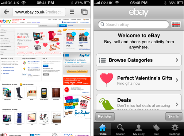
eBay's web site when viewed on an iPhone (left) compared with their dedicated mobile application.
No. Responsive web design is about adjusting the layout of web pages so that the site adapts to different resolutions, image sizes and scripting abilities. This is important, but it's not enough.
Designing for red routes is about more than changing the layout to make the content flow better on a small screen: it's about prioritising the key tasks and throwing content away. Designing for red routes means that you need to remove the less important functions from your application.
Red routes are the critical tasks that users need to complete with the application. Most desktop applications sport a dizzying array of functionality but most users only ever use a small subset of that functionality. With each successive release of an application, additional features are added like blades in a Swiss Army knife to encourage people to upgrade.
One application where this is most obvious is in Microsoft Word. Figure 2 shows the growth in menu items in Microsoft Word with each successive release. The key tasks — the red routes — didn't change as Word evolved. People still bought Microsoft Word for the same reason: to create and print documents. But these extra functions gradually began to obscure Word's key functions. This eventually made Word so bloated that Microsoft's design team effectively started from scratch and developed the Office Ribbon.
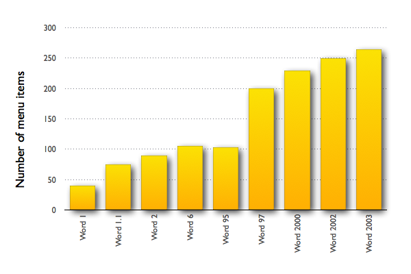
The growth of menu items in Microsoft Word. Re-drawn from The Story of the Ribbon.
The red routes for your mobile application will be a subset of the tasks supported by your desktop application or your web site. If you've ever spent time with your users, you should have a good idea of what these key tasks are. If you haven't, try these exercises.
Even if you're a hunt and peck typist, you use two hands to interact with your desktop computer. You have a full size keyboard that makes typing fast and a mouse that makes it easy to select items on a screen without worrying about clicking on the wrong target.
Mobile devices are different:
This means you need to think twice before you ask you users to enter data. Before you request data input, ask yourself if the application really needs the information you're asking for. For example, do you really need to know someone's title on a registration form?
If you think the answer is Yes, ask yourself again before you move on. If you can get rid of a field, do so. Review all of your forms and distinguish between fields that absolutely must be completed and others which are optional. If a field is optional, remove it.
Another good design approach is to make sure that you don't ask users to enter information you can get from somewhere else. For example, rather than ask someone to enter their current location, use the geolocation feature and do the work for them. If people have used the app in the past, see if you can use their previous data to autopopulate fields.
And given the difficulty of entering data with a mobile phone, it's simply more polite to make sure you give users the correct keypad when you ask them to enter data. For example, Figure 4 shows the same form but in one version, HTML5 form controls have been used to define the field as a telephone number. This makes it quicker and easier for the user to enter a telephone number rather than having to struggle with the smaller, QWERTY keyboard.
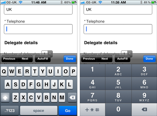
In the design on the left, the keyboard defaults to text entry, which means that the user needs to first select the numerical keypad and then use small buttons to enter a phone number. In the alternative design on the right, HTML5 form controls have been used to make the keyboard default to a telephone keypad, which makes entering a phone number much easier.
Another difference with your desktop computer is that people are familiar with the interaction conventions. With a mouse, you'll click on objects, scroll and select. We're still in unfamiliar territory with mobile devices. Will your users know that they can zoom or swipe with your mobile app?
On your desktop computer there are a small number of applications that you use frequently. The chances are that you have these applications open now, while you're reading this article. These applications are the key ones that you use to do your job: Photoshop if you're a graphic designer, Excel if you're an accountant, Dreamweaver if you're a web designer. You spend hours every day in these applications and you know them well. You know the various keyboard shortcuts to work quickly and you know how to work around features that have been poorly implemented.
You work very differently with mobile applications. You probably have dozens of applications on your phone that you dip into and out of when you are out and about. I just checked on my iPhone and there are over 30 applications that I haven't opened for months. Think how you use mobile apps and you'll soon realise that you use these applications either to kill time while waiting in line somewhere or you use them to do a very specific task. You probably use the applications intermittently, for few seconds or a few minutes. Unless you're on a transatlantic flight and dealing with an Angry Birds obsession, it will be rare indeed for you to use an application for an hour at a time.
If your mobile app has a big brother counterpart on the desktop, think carefully about how the two will integrate. Consider the iPod app on an iPhone. The main purpose of this app is to allow you to select and play songs or podcasts on your iPhone. You can't use this app to digitise your record collection and you can't even create new playlists: this functionality is built into iTunes — the iPod app's big brother. Apple realise that the iPod app will be used transiently and by restricting the tasks you can do to the critical ones for mobile, it has the added benefit of making the iPod app less cluttered and much easier to use.
When first designing for mobile, there's a real temptation to replicate the full functionality of a desktop application into the mobile version. But shrink rays don't work. Instead, think about the key tasks you need to support. Deliver those tasks for people with fat fingers who want to use your app for a few minutes at a time and you'll be well on your way to designing an appstore success.

Dr. David Travis (@userfocus) has been carrying out ethnographic field research and running product usability tests since 1989. He has published three books on user experience including Think Like a UX Researcher. If you like his articles, you might enjoy his free online user experience course.

Gain hands-on practice in all the key areas of UX while you prepare for the BCS Foundation Certificate in User Experience. More details

This article is tagged mobile.
Our most recent videos
Our most recent articles
Let us help you create great customer experiences.
We run regular training courses in usability and UX.
Join our community of UX professionals who get their user experience training from Userfocus. See our curriculum.
copyright © Userfocus 2021.
Dr. David Travis (@userfocus) has been carrying out ethnographic field research and running product usability tests since 1989. He has published three books on user experience including Think Like a UX Researcher.
Get hands-on practice in all the key areas of UX and prepare for the BCS Foundation Certificate.
We can tailor our user research and design courses to address the specific issues facing your development team.
Users don't always know what they want and their opinions can be unreliable — so we help you get behind your users' behaviour.