
UX Certification
Get hands-on practice in all the key areas of UX and prepare for the BCS Foundation Certificate.

It is the 30th anniversary of the creation of the most used questionnaire for measuring perceptions of usability. The System Usability Scale (SUS) was released into this world by John Brooke in 1986. It has become an industry standard with references in over 600 publications. Jeff Sauro, May 2, 2016
The System Usability Scale (SUS) was originally created as a “quick and dirty” scale for administering after usability tests on systems like VT100 Terminal (“Green-Screen”) applications.
SUS is technology independent and has since been tested on hardware, consumer software, websites, cell-phones, IVRs and even the yellow-pages.
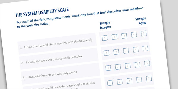
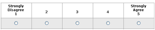
The SUS is a 10 item questionnaire with 5 response options.
The SUS uses the following response format:
Despite the wide usage of SUS, there has been little guidance on interpreting SUS scores, acceptable modifications to the items and information on reliability and validity.
Over the years I’ve used SUS a lot in my own research and during usability evaluations. During this time I’ve reviewed the existing research on SUS and analyzed data from over 5000 users across 500 different evaluations.
This data shows that SUS is a reliable and valid measure of perceived usability. It performs as well or better than commercial questionnaires and home-grown internal questionnaires.
I’ve put these findings in a 150 page detailed report which contains valuable insights on background, benchmarks and best practices for anyone using the SUS. Here are a few highlights.
The average SUS score from all 500 studies is a 68. A SUS score above a 68 would be considered above average and anything below 68 is below average.
The best way to interpret your score is to convert it to a percentile rank through a process called normalizing. I’ve created a calculator and guide which takes raw SUS scores and generates percentile ranks and letter-grades (from A+ to F) for eight different application types.
The graph below shows how the percentile ranks associate with SUS scores and letter grades.
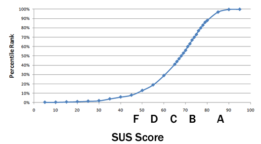
This process is similar to grading on a curve based on the distribution of all scores. For example, a raw SUS score of a 74 converts to a percentile rank of 70%. A SUS score of 74 has higher perceived usability than 70% of all products tested. It can be interpreted as a grade of a B-.
You’d need to score above an 80.3 to get an A (the top 10% of scores). This is also the point where users are more likely to be recommending the product to a friend. Scoring at the mean score of 68 gets you a C and anything below a 51 is an F (putting you in the bottom 15%).
Even though a SUS score can range from 0 to 100, it isn’t a percentage. While it is technically correct that a SUS score of 70 out of 100 represents 70% of the possible maximum score, it suggests the score is at the 70th percentile. A score at this level would mean the application tested is above average. In fact, a score of 70 is closer to the average SUS score of 68. It is actually more appropriate to call it 50%.
When communicating SUS scores to stakeholders, and especially those who are unfamiliar with SUS, it’s best to convert the original SUS score into a percentile so a 70% really means above average.
While SUS was only intended to measure perceived ease-of-use (a single dimension), recent research shows that it provides a global measure of system satisfaction and sub-scales of usability and learnability. Items 4 and 10 provide the learnability dimension and the other 8 items provide the usability dimension. This means you can track and report on both subscales and the global SUS score.
Reliability refers to how consistently users respond to the items (the repeatability of the responses). SUS has been shown to be more reliable and detect differences at smaller sample sizes than home-grown questionnaires and other commercially available ones.
Sample size and reliability are unrelated, so SUS can be used on very small sample sizes (as few as two users) and still generate reliable results. However, small sample sizes generate imprecise estimates of the unknown user-population SUS score. You should compute a confidence interval around your sample SUS score to understand the variability in your estimate.
Validity refers to how well something can measure what it is intended to measure. In this case that’s perceived usability. SUS has been shown to effectively distinguish between unusable and usable systems as well as or better than proprietary questionnaires. SUS also correlates highly with other questionnaire-based measurements of usability (called concurrent validity).
SUS was not intended to diagnose usability problems. In its original use, SUS was administered after a usability test where all user-sessions were recorded on videotape (VHS and Betamax). Low SUS scores indicated to the researchers that they needed to review the tape and identify problems encountered with the interface. SUS can be used outside of a usability test for benchmarking, however, the results won’t shed much light on why users are responding the way they are.
Users may encounter problems (even severe problems) with an application and provide SUS scores which seem high. Post-test SUS scores do correlate with task performance, although the correlation is modest (around r= .24 for completion rates and time), which means that only around 6% of the SUS scores are explained by what happens in the usability test. This is the same level of correlation found with other post-test questionnaires.
At only 10 items, SUS may be quick to administer and score, but data from over 5000 users and almost 500 different studies suggests that SUS is far from dirty. Its versatility, brevity and wide-usage means that despite inevitable changes in technology, we can probably count on SUS being around for at least another 30 years.
Jeff is presenting a seminar on Measuring the User Experience in London on June 15th 2016. This is a half-day workshop for researchers and designers who want to use numbers to inform design and make better decisions about websites, software or mobile apps. Sign up here.

Jeff Sauro (@measuringu on Twitter) is a Six-Sigma trained statistical analyst and pioneer in quantifying the user experience. He specialises in making statistical concepts understandable and actionable. He is the author of five books, including Customer Analytics for Dummies and Quantifying the User Experience.

Gain hands-on practice in all the key areas of UX while you prepare for the BCS Foundation Certificate in User Experience. More details

This article is tagged metrics, usability testing.
Our most recent videos
Our most recent articles
Let us help you create great customer experiences.
We run regular training courses in usability and UX.
Join our community of UX professionals who get their user experience training from Userfocus. See our curriculum.
copyright © Userfocus 2021.
Jeff Sauro (@measuringu on Twitter) is a Six-Sigma trained statistical analyst and pioneer in quantifying the user experience. He specializes in making statistical concepts understandable and actionable. He is the author of five books, including Customer Analytics for Dummies and Quantifying the User Experience.
Get hands-on practice in all the key areas of UX and prepare for the BCS Foundation Certificate.
We can tailor our user research and design courses to address the specific issues facing your development team.
Users don't always know what they want and their opinions can be unreliable — so we help you get behind your users' behaviour.