
UX Certification
Get hands-on practice in all the key areas of UX and prepare for the BCS Foundation Certificate.

Paper prototyping is probably the best tool we have to design great user experiences. It allows you to involve users early in the design process, shows you how people will use your system before you've written any code, and supports iterative design. So why are some design teams still resistant to using it? Here are 7 objections I've heard to paper prototyping and why each one is mistaken.
When given a pencil and paper, most people (myself included) will tend to doodle words rather than draw pictures. Art was never my subject at school, so when I see wonderful, artistic renditions of user interfaces, I tend to feel somewhat humble. I can't draw like that, my inner voice reminds me, so don't pretend you can sketch a user interface.
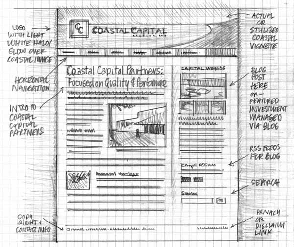
Figure 1: A beautiful prototype on paper, but not a paper prototype. By Mike Rhode on flickr (some rights reserved)
But just because its on paper, it doesn't mean it's a paper prototype.
A paper prototype is a sketch — a quick visualisation of your idea. The artistic merit of your sketch is irrelevant. The purpose of paper prototyping is to evaluate the idea behind the user interface, not the sketch itself. Paper prototypes are quite literally 'artless': simple and unaffected.
Figure 2: A paper prototype. It's not pretty but the whole prototype was created in minutes by one of the delegates on our Web usability training course.
This focus on 'neat and pretty' is one of the biggest obstacles to overcome with paper prototyping. It has even spawned a real industry. For example, search the web and you'll find imaginative stencil sets for iPhone, web, iPad and Android. These kind of tools simply feed the paranoia of people who worry their sketches aren't pretty enough.
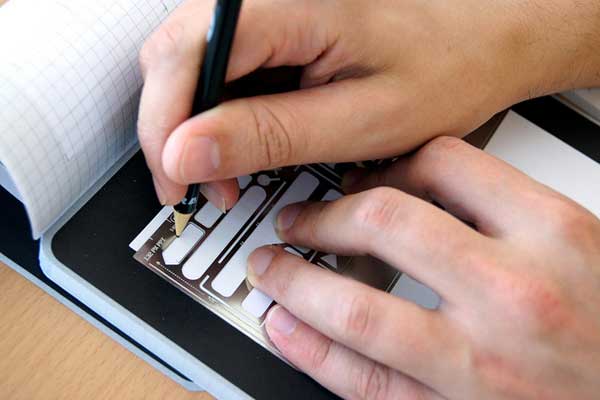
Figure 3: User interface stencils like these give confidence to the artistically challenged but reinforce the myth that paper prototypes need to be precise and accurately drawn. By Luca Mascaro on flickr (some rights reserved)
Wireframes show a skeleton view of a user interface. They identify the areas of the screen where content will appear, such as images, text and navigation. Wireframes often include call-outs and notes explaining certain elements of the design in more detail. They are a useful communication tool for design agencies who want their clients to sign off on a design without getting hung up on the colours and images displayed in the user interface.
Figure 4: Some designers find wireframes a useful way to communicate a design to their clients. But wireframes are not paper prototypes. By Sebastian Heit on flickr (some rights reserved)
But wireframes don't work as paper prototypes for at least two reasons:
Many information architects are obsessed with wireframes but in most projects, they aren't needed: they are just a bureaucratic overhead. You'll find that an electronic prototype, modified as the project progresses, provides a much more useful design communication tool than a wireframe.
I've often heard developers object to paper prototyping because they can mock up an interface in Visio, or another favourite tool, in the same time it takes to sketch one out. Developers point out that electronic prototyping scores over paper because it is easier to cut and paste repeating elements (like navigation bars) rather than go through the exercise of re-sketching them. And electronic prototypes can be shown to users over the Internet and tested remotely.
Ironically, 'cut and paste' is exactly what paper is good for — you just need real scissors and glue. You can quickly duplicate elements of a paper prototype with a photocopier or even mock-up the repeating elements in Visio and glue them to your sketched user interface. (If you'd like a starter kit, download and print our paper prototyping helper kit. This provides more flexibility than a stencil yet doesn't express the same imperative to draw neatly).
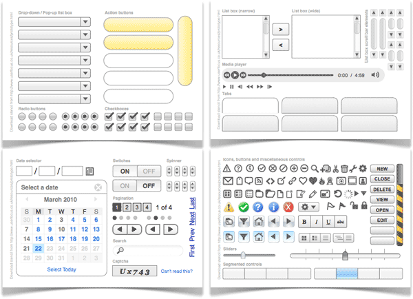
Figure 5: Mock up repeating elements in your preferred drawing application (these were done in OmniGraffle), cut them out and glue them onto your paper prototype. From the paper prototyping helper kit.
Similarly, paper prototypes can be tested remotely: you simply scan in your sketches and chain the screens together in PowerPoint or Keynote. You can even record the sessions with usability testing software like Morae.
There is certainly a time for prototyping with electronic tools — but that time isn't the early design phase, for a couple of reasons.
I think there's a deeper issue here, to do with confidence. Developers feel happy in front of a computer: it's their domain and it's what they're skilled at. Take away their computer and they feel a bit… naked. But this massively undervalues another key skill that developers have: problem solving. As the development team at Red Gate Software point out, more developers should realise that their skills extend way beyond that of the keyboard.
Many designers I've spoken with tell me that they already do paper prototyping — they just do it on a white board or flip chart instead. The design team then discuss the ideas and refine them before moving to implementation.
Figure 6: Using a whiteboard to generate design ideas like this one is a good way to brainstorm but not a good way to prototype, because you can't test out the interface. By Frankie Roberto on flickr (some rights reserved).
Whiteboarding, and its close cousin sketchboarding, are terrific creativity tools, used by design heavyweights like Adaptive Path — but they're not paper prototyping. These techniques remind me of Gerry McGovern's joke that the worst possible way to design a web site is to have five smart people in a room drinking lattes and discussing branding. The purpose of paper prototyping is to quickly generate design ideas that you can test out with users. It's not for coming up with design ideas that can be voted on by the design team. This is because paper prototyping isn't just about design — it's about iterative design: creating stuff you can test quickly and then discard or improve upon.
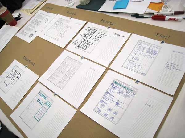
Figure 7: Sketchboarding is a wonderful creativity tool, but it's not paper prototyping because the designs aren't tested with users. By Mack Male on flickr (some rights reserved).
Rather than hold a fruitless design meeting where you spend hours arguing over where you should put the navigation, you could spend the time more productively by creating a couple of different paper prototypes and testing out the alternatives with a handful of users. Not only will this help you make a decision quickly, you'll also have the confidence that the final decision is based on real data rather than on a designer's intuition, or worse: the HIPPO (the highest-paid person's personal opinion).
Paper prototypes use the participant's finger as the mouse and a pen as a keyboard. Interfaces are roughly drawn and are clearly not finished prototypes. This is clearly different to a real system and so a common objection is that users will behave differently with a paper prototype.
This objection has no basis in fact. A raft of published research shows that paper prototypes are just as effective as high-fidelity prototypes at detecting many types of usability issues.
There is no denying that paper prototypes lack beauty — but this is different from saying that paper prototyping is unprofessional. In my experience, so long as you get participants really using the paper prototype (rather than sitting back and having it demonstrated to them), they quickly get 'lost' in the experience of using a paper prototype. This makes issues of professionalism moot.
In contrast, I would argue that your users will think you're more professional because you're clearly involving them early in the design process and taking their comments seriously.
If your management is still unsure, run a trial with single participant and ask, “Is your opinion of our organisation better or worse after this experience?” I'll bet you'll hear only positives.
It's true that there are some intricate interaction styles that don't lend themselves to paper prototyping. Gesture-based interactions on the iPad and iPhone can't be replicated on paper. Panning and zooming, Google Maps-style, isn't practical. Similarly, applications that require continuous scrolling or that include long download or response times can't be properly emulated.
But the vast majority of web and software interaction — even on an iPhone — is still point and click (with a little keyboard too). These can easily be emulated with a paper prototype. Rather than focus on the edge case that won't work, think of the vast majority of situations where paper prototyping will work. The video below shows just how interactive paper prototypes can be.
Paper prototyping helper kit. When you’re creating a paper prototype, it saves time to have controls and buttons that you can cut out and re-use, without needing to draw your own.
Paper prototyping support tools. This is from a web site run by Caroline Snyder (who literally wrote the book on paper prototyping). It contains some useful resources for actually running a paper prototyping test.
Paper Prototyping by Shawn Medero. This article from Alistapart provides a good background and some nice visual examples.
10 Effective Video Examples of Paper Prototyping. A collection of videos showing paper prototyping usability tests in action.

Dr. David Travis (@userfocus) has been carrying out ethnographic field research and running product usability tests since 1989. He has published three books on user experience including Think Like a UX Researcher. If you like his articles, you might enjoy his free online user experience course.

Gain hands-on practice in all the key areas of UX while you prepare for the BCS Foundation Certificate in User Experience. More details

This article is tagged discount usability, iterative design, prototyping.
Our most recent videos
Our most recent articles
Let us help you create great customer experiences.
We run regular training courses in usability and UX.
Join our community of UX professionals who get their user experience training from Userfocus. See our curriculum.
copyright © Userfocus 2021.
Dr. David Travis (@userfocus) has been carrying out ethnographic field research and running product usability tests since 1989. He has published three books on user experience including Think Like a UX Researcher.
Get hands-on practice in all the key areas of UX and prepare for the BCS Foundation Certificate.
We can tailor our user research and design courses to address the specific issues facing your development team.
Users don't always know what they want and their opinions can be unreliable — so we help you get behind your users' behaviour.