
UX Certification
Get hands-on practice in all the key areas of UX and prepare for the BCS Foundation Certificate.

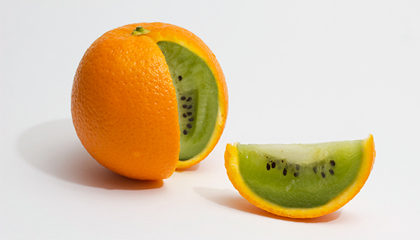
Consistency is at the heart of good product design. But consistency is often misinterpreted as making things look or behave the same way. This ignores context and can lead to a "foolish consistency". Instead of consistency, designers should adhere to "the Principle of Least Surprise".
We've all had the experience of launching a new application only to discover that the development team have had an attack of brand. This is when they decide to create unique scroll bars, radio buttons or other user interface elements so that they "highlight the brand values". This usually requires the controls to look or to behave differently to similar controls in other applications. Presumably, this is to make their application stand out from the competition. It certainly achieves that goal, although perhaps not in the way the team intended.
Those kinds of inconsistencies are easy to spot. But there are other examples of inconsistency that are harder to identify. And ironically this is often because teams are actually trying to be consistent.
Let me explain.
I've seen the consistency principle described as the "Principle of Least Surprise", which means, basically, you shouldn't surprise the user with the way a command or interface object works. I prefer this way of phrasing it because it makes it clear that you need to understand context to decide if a design is consistent. Inconsistencies occur when development teams focus on visual consistency or interaction consistency but ignore context.
Context matters because it prevents us from creating what I call "foolish consistency". Making things look or behave the same is pointless if the user can no longer accomplish their tasks. By describing consistency as the "Principle of Least Surprise", we make it clear we should prioritise making things useful above making them consistent.
Here's a couple of interesting examples. The first shows a seemingly inconsistent visual design. The second shows a seemingly inconsistent interaction design. But in my view, both are consistent with the "Principle of Least Surprise" because they are consistent with context.
Exhibit 1 is from Apple's Clock app on iOS. When a timer completes, the lock screen shows 'Stop' as the default choice and 'Repeat' as an alternative, subsidiary option.
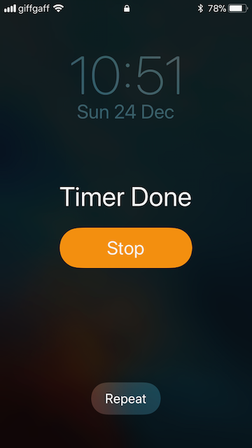
'Stop' is the default choice and 'Repeat' is the subsidiary option.
Now look what happens when an alarm goes off. Now, 'Stop' is the subsidiary option and 'Snooze' is the default choice.
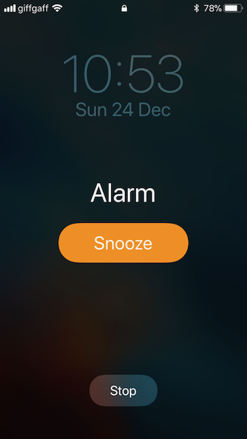
'Stop' is the subsidiary option and 'Snooze' is the default choice.
The visual design of the Timer function seems inconsistent with the visual design of the Alarm function. But consistency is not just about the labels we use for actions but about the effect of those actions. Apple's design team decided that the standard action when an alarm goes off is to snooze. So they are being consistent with the user's goal, which means they need to be inconsistent with the visual design.
Personally, I always get up straight away. For people like me, who might hit snooze by mistake, you can turn off the 'Snooze' option when you set the alarm. If you do this, 'Stop' becomes the default choice and there's no subsidiary option.
Before showing you exhibit 2, let me set you a quiz. What would be the consistent choice for the behaviour of a back button in a web browser?
I'm sure you chose A as the consistent choice. It's difficult to imagine any situation where B might be consistent. But as I've said, consistency depends on context.
I've often observed people in usability tests who want to click the back button, but can't, when a web site decides to open links in a new tab. Because users tend to focus on the web page content, they're not aware that the browser has opened a new tab. Typically, their behaviour shows the following pattern:
Despite this, web developers (I'm looking at you, Facebook, LinkedIn and Twitter) still insist on opening links in new tabs because they can't bear to think that a user will desert their site. Developers often justify this by pointing to the behaviour of advanced users like themselves who often keep multiple tabs open at once. But advanced users also know about option-clicking a link to open a page in a new tab, so I'd argue there's no need to do this for them. In less experienced web users, opening tabs without the user's knowledge leads to confusion and disorientation.
Apple have dealt with this issue in Safari by enabling the back button in the new tab. If you click it, the tab closes. This is seemingly inconsistent: the back button is meant to take people back to the previous page, not close the tab.
A Back button that closes a tab.
But the end result is exactly what you want. Safari is being consistent with the user's goal, which means it needs to be inconsistent with the interaction design. It's the Principle of Least Surprise in action.
The learning point is simple. Stop talking about "consistency": this focuses on the product and ignores context. Instead, talk about "the Principle of Least Surprise" as this focuses on the user.
-oOo-

Dr. David Travis (@userfocus) has been carrying out ethnographic field research and running product usability tests since 1989. He has published three books on user experience including Think Like a UX Researcher. If you like his articles, you might enjoy his free online user experience course.

Gain hands-on practice in all the key areas of UX while you prepare for the BCS Foundation Certificate in User Experience. More details

This article is tagged guidelines, heuristic evaluation, layout.
Our most recent videos
Our most recent articles
Let us help you create great customer experiences.
We run regular training courses in usability and UX.
Join our community of UX professionals who get their user experience training from Userfocus. See our curriculum.
copyright © Userfocus 2021.
Dr. David Travis (@userfocus) has been carrying out ethnographic field research and running product usability tests since 1989. He has published three books on user experience including Think Like a UX Researcher.
 Dr. Philip Hodgson (@bpusability on Twitter) has been a UX researcher for over 25 years. His work has influenced design for the US, European and Asian markets, for everything from banking software and medical devices to store displays, packaging and even baby care products. His book, Think Like a UX Researcher, was published in January 2019.
Get hands-on practice in all the key areas of UX and prepare for the BCS Foundation Certificate.
We can tailor our user research and design courses to address the specific issues facing your development team.
Users don't always know what they want and their opinions can be unreliable — so we help you get behind your users' behaviour.