
UX Certification
Get hands-on practice in all the key areas of UX and prepare for the BCS Foundation Certificate.

Personas get a mixed reception from design teams, with some questioning their value. A typical criticism is that persona descriptions are superficially elegant but they lack substance. Another criticism is that persona descriptions are too 'final', and hard to update with new data. Adopting a lightweight persona description, such as the 2½D sketch, addresses these issues while retaining the strengths of traditional personas.
When I talk to design teams about user research, none of them has ever said that usability testing is a bad idea.
Some will tell me that they do not have the money or inclination to do usability testing, but everyone agrees it has obvious face validity.
The same goes for nearly every user research method in my toolbox.
Save one.
Personas.
Personas seem to be like Marmite. Some design teams love them and jump in with both feet. But there are other teams that are more sniffy about them. Personas, they say, seem suspiciously definitive. Our audience is too large to be summed up by a handful of personas. Personas seem too shallow. We tried personas and it didn’t work. And more recently: "What’s the point of wasting time with personas when we can speak to our users directly?"
Before discussing a potential reformulation, it’s worth reviewing briefly the history of personas, why they got their bad reputation, and what they are good for.
Personas were invented by Alan Cooper and first described in his book, ‘The Inmates are Running the Asylum’. Cooper presented them as a way of summarising the key attributes of different user groups. Their purpose, he said, is to avoid designing for an ‘elastic’ user: a design target that bends and stretches according to the whims of the design team.
“Developing for the elastic user gives the developer license to code as he pleases while paying lip-service to ‘the user’. Real users are not elastic.” — Alan Cooper (1999), ‘The Inmates are Running the Asylum’, p127.
What are personas? In their 700+ page doorstop of a book, ‘The Persona Lifecycle’, Pruitt & Adlin describe personas as “detailed descriptions of imaginary people constructed out of well-understood, highly specified data about real people.” The most common artefact from a persona activity is a persona description: a one-page portrayal of a user archetype, describing the persona’s goals, motivations, and behaviours. To help design teams empathise with users, there is usually a photograph of the persona, some back story, and a quotation that summarises the key user need.
Personas went on to spawn an industry. Cooper’s book chapter was followed by web sites, journal articles, conference tracks and yet more books, all devoted to personas.
Why? What was behind the enthusiasm for this method?
To understand why personas became so popular, we need to understand that, at the time, many development teams had never seen a user. Some didn’t even know who their users were. In this situation, personas were like a gift from the gods. A team of researchers from an agency — and it usually was an agency, not an internal team — would go out and find the users, describe them in ways that were useful for design, and then present them to the development team as fully formed characters. The agency took on the role of translator, acting as a go-between to help developers connect with their users. Like a team of Victorian explorers visiting an exotic tribe, the agency journeyed into uncharted territory and returned with pictures and artefacts — personas — to amaze everyone.
I think there were three developments that clouded design teams’ views on the usefulness of personas.
First: because Agile. “Development” teams morphed into “design” teams. Engaging with users became more of a norm and less of an exception. This is good for user experience, but it’s bad news for ‘traditional’ personas. Traditional personas began to look too finished, too final. Teams were savvy enough to know that fully formed, completed descriptions of users are an impossibility at the early stages of design. Instead, they wanted conversation starters. To use the agile terminology, design teams wanted to get a “shared understanding” of their users and they were suspicious of any attempt to set requirements in concrete.
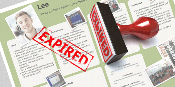
Second, personas began to become a parody of themselves. Photographs were taken from stock libraries and showed beautiful, happy, lifestyle images of people using… accountancy software. Teams stuck persona descriptions onto action men figures, beer glasses, packs of candy and life-sized photographs. Even the most conservative personas tended to be shown as a glossy leaflet, implying a robustness and finality to the user research that was almost certainly unjustified. Above all, none of these artefacts could be easily changed as the team learnt new information about users.
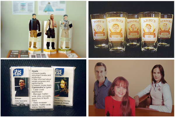
4 examples of personas. Top left: Persona Action Men (from Cisco, photo source unknown). Top right: Persona beer glasses (Pruitt & Adlin, p317). Bottom left: Persona Tic-Tacs (Pruitt & Adlin, p335). Bottom right: Persona cut-outs (Mulder & Yarr, p209).
And third, in a parallel track, marketeers discovered personas and they liked the taste. Marketing teams created versions of personas to represent market segments. Because they used the magic term ‘personas’, development teams were discouraged from developing their own, not realising that a market segment might contain multiple personas. More cynically, the purpose of marketing personas is primarily to sell more stuff, whereas design personas need to reveal the user behaviours relevant for a product. Development teams couldn’t use marketing personas to make design decisions, so they decided personas weren’t that useful. (It wasn't helped by the fact that marketeers seem fond of giving their personas silly names, such as "Social Butterfly Brenda" or "Value Hunter Valerie", that attempt to collapse nuanced research into a single concept. This trivializes the research, resulting in designers rolling their eyes and shaking their heads.)
But if we reject personas, we risk throwing out the baby with the bathwater. This is because we are left with knowledge about individual users who may or may not be representative. Just because you have regular contact with users, it doesn’t mean you know who your users are. Let me explain.
One of the great benefits of personas is that they allow you to see the big picture and not get distracted by the raw data. When doing user research, we start with raw data, but it’s messy. Individuals are idiosyncratic. They have rough edges that don’t apply to similar users of that type. If we don’t analyse and then synthesise our data, we risk getting misled by the user who complains the loudest, or the one that’s most helpful, or the one who has an interesting, but isolated, need. Data analysis smooths out these rough edges.
It’s great that your team has regular contact with users. But even if you reject personas, you still need to step back, interpret your data and think about the types of user in your audience: otherwise you’ll fall into the “elastic user” trap articulated by Alan Cooper.
Let me take you on a short detour.
In 1982, David Marr described a computational model of human vision. One of the components of his model was the concept of a “2½D Sketch”. Without labouring the details, this idea attempts to capture the notion that the visual system never has enough information to see all sides of an object, so it fills in the gaps. An oft-cited example is to imagine someone with his back turned to you. You make assumptions that this person has a front too, and you would be mightily surprised if he turned around and you discovered he had no face. The “2½D Sketch” is a metaphor for the fact that our visual system is using data to actively construct the world, based on reasonable assumptions.
I think we can apply this metaphor to persona descriptions: after all, what the design team are doing is using data to actively construct its view of the user, based on reasonable assumptions. So rather than create a formal persona description with requirements cast in concrete, we can create a 2½D Sketch. This artefact will remind us that we will never have enough information to see all sides of our user: what we have is an approximation. It’s a conversation starter: a way to arrive at a shared understanding of our audience. The use of the word ‘sketch’ also reminds us that we don’t want to create anything too ostentatious: the medium (which looks unfinished) is the message. We’re looking for persona descriptions that are lightweight, disposable and, well, agile. Jared Spool describes this well when he points out, “Personas are to Persona Descriptions as Vacations are to Souvenir Picture Albums.” It’s the process of user research that matters, not the beauty of the final artefact.
The best conversation starters are flexible enough to change easily. They shouldn’t look like they have been cast in concrete. Here’s one approach I’ve used that meets this criterion.
Get prepared. You'll need a few sheets of flip chart paper, some Sharpies and a pack of sticky notes. Call a design meeting and get your team to attend.
Begin by coming to a shared understanding of the user research you have done up to this point. (This is important: you still need to have done the user research you're not going to brainstorm a persona out of thin air). Use this part of the meeting to come to a consensus on the different groups of user in your audience.
The next step is to create one or more 2½D sketches on a sheet of flip chart paper. Arrange the flip chart paper in landscape format and split it into four quadrants.
Working as a team, complete your 2½D Sketch. Prioritise the stickies in each quadrant. Have a conversation. Work towards a shared understanding.
Above all, don’t take this away and spend hours turning it into a finished, polished persona. Instead, spend your time speaking to users. Then find some wall space to post your 2½D Sketch and update it with the new information you've collected.
Cooper, A. (1999) The Inmates Are Running the Asylum. Indianapolis, IN: SAMS.
Mulder, S. and Yaar, Z. (2006). The User Is Always Right: A Practical Guide to Creating and Using Personas for the Web. Berkeley, CA: New Riders.
Pruitt, J. and Adlin, T. (2006). The Persona Lifecycle: Keeping People in Mind Throughout Product Design. San Francisco, CA: Morgan Kaufmann.

Dr. David Travis (@userfocus) has been carrying out ethnographic field research and running product usability tests since 1989. He has published three books on user experience including Think Like a UX Researcher. If you like his articles, you might enjoy his free online user experience course.

Gain hands-on practice in all the key areas of UX while you prepare for the BCS Foundation Certificate in User Experience. More details

This article is tagged personas.
Our most recent videos
Our most recent articles
Let us help you create great customer experiences.
We run regular training courses in usability and UX.
Join our community of UX professionals who get their user experience training from Userfocus. See our curriculum.
copyright © Userfocus 2021.
Dr. David Travis (@userfocus) has been carrying out ethnographic field research and running product usability tests since 1989. He has published three books on user experience including Think Like a UX Researcher.
Get hands-on practice in all the key areas of UX and prepare for the BCS Foundation Certificate.
We can tailor our user research and design courses to address the specific issues facing your development team.
Users don't always know what they want and their opinions can be unreliable — so we help you get behind your users' behaviour.