
UX Certification
Get hands-on practice in all the key areas of UX and prepare for the BCS Foundation Certificate.

User experience professionals often complain that design teams fail to take action on the findings from user research. But researchers need to shoulder some of the blame: research reports are often too wordy, arrive too late and fail to engage teams with the data. Dressed-down personas, customer journey maps, photo-ethnographies, affinity diagramming, screenshot forensics and hallway evangelism provide 6 alternatives.

Photo by Matt Botsford on Unsplash
Jill had spent weeks shadowing her users. She had carried out site visits, ran user interviews and moderated usability tests. She had observed the way people used similar products day-to-day and she felt she really understood the struggles that people faced when achieving their goals.
With lots of data to analyse and present, she gave herself a full week to prepare the report. She analysed the data. She typed up comments from users. She told stories about the way people lived. As she attached the report to her email and hit the ‘Send’ button, she congratulated herself on a job well done. Any outsider would agree: this was truly an excellent piece of work.
Over the following week, she waited for the comments to come in. There was just one. “Thanks for the report, Jill” said the email from the lead developer. “I’ll get back to you.”
But he never did.
In a post-agile world, design teams don’t have the time or inclination to read research reports — especially when they cover material that would have been useful 3 months ago but that is now so far back in sprint-land that it may well have been another project. User researchers often misinterpret this behaviour, instead thinking that design teams aren’t interested in user research. In reality, the design team is hungry for practical knowledge about users. The problem is that we’re now in a world of just-in-time user research — and 3 months ago is not just-in-time.
What could Jill have done differently?
I’ll describe 6 techniques for engaging agile teams in the results of user research: 3 techniques for user needs research and 3 techniques for usability testing. But before describing the techniques, there’s a fundamental principle about presenting the results back to design teams that is worth bearing in mind: User research is a team sport.
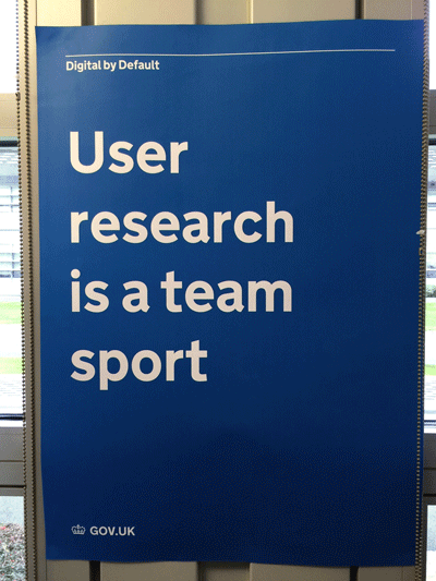
‘User Research is a team Sport’ poster spotted in HMRC’s Digital Delivery Centre, Newcastle.
The whole concept of presenting the results of user research to design teams is predicated on the assumption that the design team don’t experience the user research first-hand. What if the design team were present when the research takes place?
Jared Spool has pointed out that the most effective design teams have a 2-hour dose of exposure to users every six weeks. So what if teams worked together to plan the research (to ensure it will answer the right questions), to observe the research sessions as they happen, and to analyse the data? In such a world, the whole need for reporting is moot, since the design team has seen the research first-hand.
It may sound like Nirvana, but it’s not as hard to achieve as you might think. One way you can encourage this behaviour in design teams is by creating and maintaining a simple dashboard to help the team appreciate this requirement. Here’s an example of such a dashboard from a project I worked on recently.
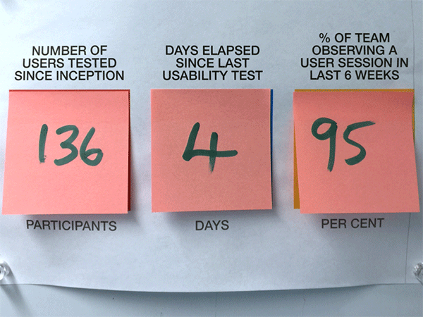
A user research dashboard showing the number of participants involved since the start of the project (136), the time elapsed since the last usability test (4 days) and the proportion of the agile team that has observed a user session in the recent past (95% in the previous 6 weeks).
That number on the right (95%) shows the proportion of the team who have observed a user session in the last 6 weeks. This makes sure people are getting their exposure hours.
The other metrics show the number of users tested since inception (this makes sure that there is a continual focus on users) and the number of days elapsed since the last usability test (this ensures that the project is practising iterative design).
But what if you’re in Jill’s position and for whatever reason, you didn’t get the design team engaged in the research? In that case, the next best thing is to get the team arguing over real data instead of what they think users want. Developers like to solve problems: it’s what they do best. In the absence of data, agile teams will solve the problem that’s been formulated in the team’s shared consciousness. To prevent this, expose people to the raw data and get them analysing it.
And that’s where our six techniques come in.
In this section, I’ll review three methods for engaging the design team with the data from user needs research, such as field visits and customer interviews. These methods are:
If you’re a regular reader of Userfocus articles, I’m sure you don’t need reminding about personas. But there’s a common mistake that people make with personas: people often can’t think beyond the persona deliverable (whether it’s in the form of an A4 sheet, a poster or a life-sized cut out). As a consequence, there’s often an over-emphasis on perfecting the deliverable. This can result in a persona that looks rather too polished, populated as it is by beautiful people from stock photography world. The persona risks looking and sounding too definitive and certainly doesn’t acknowledge the fact that there may be considerable ambiguity over user needs.
Here’s an antidote that I learnt from Janice Fraser: I call it the dressed-down persona. As with dress-down Friday, it doesn’t look very smart — but it does the same job.
Divide a piece of flip chart paper into 4 quadrants. Label the quadrants, “Name and picture”, “Facts”, “Needs and Goals” and “Behaviours”. Use sticky notes to populate each of these with the key findings. Here’s an example.
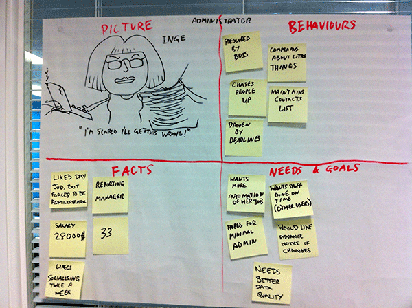
An example of a “dressed-down persona”. The persona has been created on flip chart paper and has 4 quadrants dedicated to a sketch and quotation of the persona; demographic facts; behaviours; and needs and goals.
Like most agile artefacts, the benefit of a persona is in the way it helps the team generate a shared understanding of users. A method like this, which encourages the team to interpret the data collectively, is a much sounder way of achieving this goal that the persona examples that appear when you do a search on Google.
You might also want to try this technique if your personas have been kidnapped by your marketing team. Marketeers love personas because they describe customers and look impressive. But when marketeers steal personas they often take away the stuff that’s useful for design (user behaviours, needs and goals) and replace it with stuff that’s useful for selling the product. Dressed-down personas hide their value behind this rough and ready exterior, which makes them less likely to be kidnapped.
Some people are confused by the difference between “usability” and “user experience”. If you find someone in this position, introduce them to the customer journey map. If there’s a better way of helping someone understand the difference, I’m yet to see it.
A customer journey map (and its close cousin the mental model diagram) illustrates the steps in the user experience from the beginning of the process to the end of the process. “Process” here means the context in which people are currently achieving their goals, so this method works well to characterise the results of a field visit.
The process is fairly simple. Start with a set of sticky notes that contain the observations you made during the site visit. Each sticky note contains a single observation.
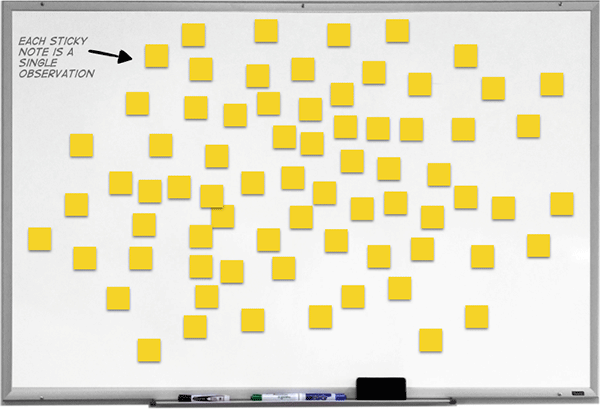
A whiteboard with a number of yellow sticky notes. Each of the sticky notes contains an observation from a contextual inquiry or site visit.
Working as a team, group the observations into common tasks that people carry out.
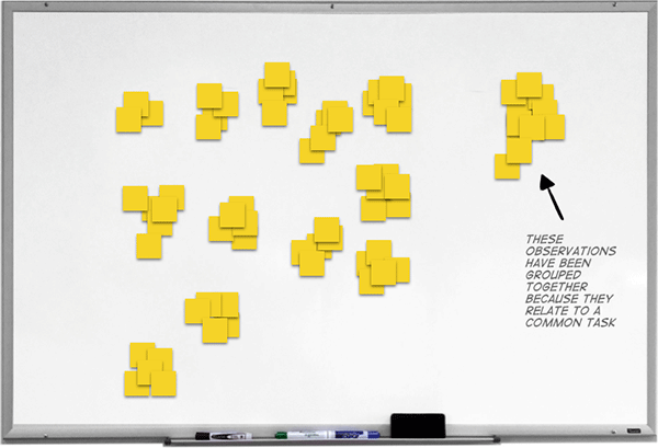
This shows the same whiteboard, but now the yellow sticky notes with the observations have been placed into 13 groups, where each group relates to a common task.
Next, label each of the tasks with a shorthand name. This doesn’t need to be the term that users use to describe the task as it’s just your own shorthand.
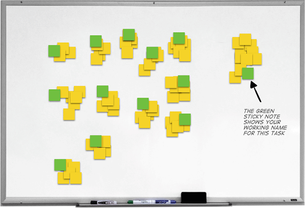
Each of the groups has now been given a group title using a yellow sticky note. The group title is simply the working name for this task.
Now organise the tasks in a set of vertical columns, showing tasks that occur early in the experience and tasks that occur later.
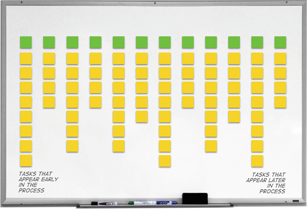
At this point, the sticky notes are arranged into a sequence of vertical columns from tasks that appear early in the process to tasks that appear later in the process. The green note (with the task title) is placed at the top of each column and each of the yellow sticky notes that relate to that task are placed below it.
As an optional step, you may want to group some of the tasks together into phases that make sense. In this example, the stages of an online transaction have been defined as “Anticipate”, “Enter”, “Engage”, “Exit” and “Reflect”.
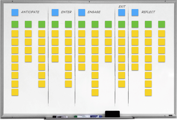
The user experience has been divided into 5 sequential areas, such as “Anticipate” and “Reflect”. Each of these broad areas contains one or more sub-tasks.
At this point, we have an overall view of the user experience that we can use to see the big picture. This is often sufficient for the team to build a shared understanding of the user research, but as an optional next step you could ask the team to dot-vote on the areas of the user experience that the research shows to be especially problematic.
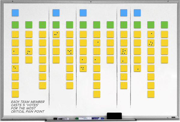
In this final stage, members of the agile team have dot-voted on the customer journey map to identify the areas that contain the most critical pain points.
In this section, I’ve just scratched the surface of customer journey mapping. If you’d like to dive deeper, the best book on the topic is User Story Mapping by Jeff Patton.
Whenever I speak with someone who has just returned from a site visit, the first comment I usually hear is that the user’s environment was very different to what the researcher expected. We all have assumptions about the user’s context and one of the great benefits of carrying out a site visit is that it usually challenges those assumptions.
One way you can share these experiences with the design team is to make a video recording of the environment. This is a technique that’s widely recommended by US researchers — but it’s time for me to make a confession: despite carrying out contextual research for over 20 years, I’ve never been able to make video recordings in the user’s environment. If the person I’m visiting isn’t aghast at the suggestion, then there will almost certainly be a very long form I need to complete to get permission from the organisation or the people who run the building. Maybe British people are more reserved. But whatever the reason, I’ve personally found video recording users (outside of a usability lab) problematic.
If your goal is to share with the design team what the environment looks like, then there’s a much simpler, and just as effective, technique: take photographs of the user’s context.
You should take three kinds of photograph:
Shy researchers struggle when asking to take someone’s photograph. The trick here is to normalise your behaviour. When I first meet the person I’m interviewing, I’ll say, “While I’m here today, I need to take some photographs with my phone so I can share the experience with other people on the design team. Here’s a list of some of the things I need to photograph. Take a look at this list, and if any of them are off-limits for any reason, just draw a line through the item and I’ll make sure not to take photos of it.” I then pass the participant a list with items on it like “You”, “Your desk”, “Your computer”, “Your computer screen”, “The technology you use”, “Papers you use for your job”, “Manuals” and “The wider environment”. You could also ask, “What other things do you think I should photograph to understand the work you do?”
Photographs provide an incredible amount of additional insight. Don’t be the researcher who’s too shy to take photographs.
When you return from the visit, print off the photos you’ve taken and use them to create a “photo ethnography”: a kind of mood board that shows users in their environment. People enjoy looking at photographs and this is a simple and effective way to get people engaged in the context of the user.
In this section, I’ll review three methods for getting the design team engaged with the results from usability testing. These methods are:
The process of affinity diagramming is very similar to the process of creating a customer journey map. The difference is that instead of trying to build up a picture of the total user experience, you use the technique to group together usability issues experienced by different participants in a usability test.
One of the most effective implementations of this technique is to encourage the design team to observe usability test sessions and to ask each observer to note down usability problems as they occur on sticky notes. As the test sessions progress, the whiteboard gradually fills with observations. At the end of the day, all of the observers engage in a group affinity sort and together identify the key usability issues.
One problem with this method is that a day’s usability testing can be quite long. This means people are reluctant to stay into the early evening to do the analysis. Because this reaching of consensus is so important, it’s worth running shorter sessions with users, or even sacrificing the last user session of the day, to make sure there is sufficient time left for people to do the analysis. The design team is much more likely to engage with the affinity sort if it takes place at 3pm than if it takes place at 5pm.
But what about people who were unable to attend a usability test session? How can you quickly feedback the results to this audience and avoid death by PowerPoint?
Here’s a quick and effective technique that I learnt from John Waterworth that I call ‘Screenshot forensics’.
For each of the tasks in your usability test, take a screen shot of each step in the task. Stick these to a noticeboard or a wall area in a vertical sequence, with the first screenshot at the top of the board, the second screenshot below it, and so on. To the right of the screenshot, place sticky notes in one of four categories:
Here’s an example.
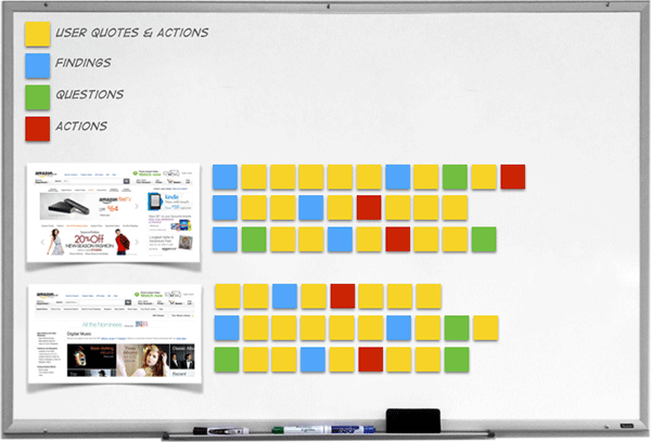
Screenshot forensics. This example shows the first two screens in a task. To the right of each screen, a series of sticky notes show user quotes and actions (yellow stickies), findings (blue stickies), questions (green stickies) and actions (red stickies).
As you can see, this kind of artefact is an information radiator that ensures everyone in the design team is made aware of what happened in the usability test.
We can build on the notion of information radiators with the concept of hallway evangelism. This technique works well when you are at the point where you have a reasonable amount of conclusive data from your discovery phase.
The idea is to summarise the key points of the user research in a poster that you can print large and place on the wall somewhere in the building. The poster, which could take the form of an infographic, briefly summarises the key research you’ve carried out: for example, it could describe 5 facts about your users, 5 findings from usability testing or 5 ways people use your product in the wild. There’s nothing magic about the number 5: just don’t drown people with your data.
If your poster design skills are rusty, head over to Canva who will do most of the heavy lifting for you.
Once you’ve designed your poster, you need to find a suitable hallway in which to place it. Look for high traffic areas (such as the route to the canteen). In her book, The User Experience Team of One, Leah Buley suggests placing posters on the inside of the doors in the Ladies and Gents bathrooms. This will certainly give you a captive audience!
If you ever find yourself in Jill’s position, first examine how you can engage the design team in the research itself. Jill's mistake was to fall for what Caroline Jarrett has termed the User Researcher's Fallacy:
User researcher's fallacy: "My job is to learn about users". Truth: "My job is to help my team learn about users". — Caroline Jarrett (@cjforms)
July 4, 2014
Remember: no presentation will be more persuasive than having the design team observe users as they do their tasks.
Then, engage the design team with the data by using dressed-down personas, customer journey maps, photo-ethnographies, affinity diagramming, screenshot forensics and hallway evangelism.
What other techniques have you used to evangelise user research? Let us know in the comments.

Dr. David Travis (@userfocus) has been carrying out ethnographic field research and running product usability tests since 1989. He has published three books on user experience including Think Like a UX Researcher. If you like his articles, you might enjoy his free online user experience course.

Gain hands-on practice in all the key areas of UX while you prepare for the BCS Foundation Certificate in User Experience. More details

This article is tagged personas, selling usability, strategy, tools.
Our most recent videos
Our most recent articles
Let us help you create great customer experiences.
We run regular training courses in usability and UX.
Join our community of UX professionals who get their user experience training from Userfocus. See our curriculum.
copyright © Userfocus 2021.
Dr. David Travis (@userfocus) has been carrying out ethnographic field research and running product usability tests since 1989. He has published three books on user experience including Think Like a UX Researcher.
Get hands-on practice in all the key areas of UX and prepare for the BCS Foundation Certificate.
We can tailor our user research and design courses to address the specific issues facing your development team.
Users don't always know what they want and their opinions can be unreliable — so we help you get behind your users' behaviour.