
UX Certification
Get hands-on practice in all the key areas of UX and prepare for the BCS Foundation Certificate.

In ‘The Lean Startup’, Eric Ries describes a design process to help manage risk when developing new products and services under conditions of extreme uncertainty. This article describes three established user experience techniques we can use to support this design process: narrative storyboarding; paper prototyping; and the Wizard of Oz.
I’ll be honest, I’m a bit late to the party.
I’ve only just completed Eric Ries book, ‘The Lean Startup’, that was published to much acclaim last year. I put off reading it, believing it would be another generic how-to-start-a-high-tech-business book. I already have a bookshelf full of these kinds of book, most of them unread beyond the initial chapter.
But now I’ve read it I think that it should be obligatory reading for any UX person.
What I like about the book is that it puts UX at the very heart of new product design — and does so in language that will make managers sit up and take notice.
Here’s my version of the digested read.
Sound familiar? There’s obviously a lot more in the book than these five points but I hope there’s enough here to make you realise how congruent this approach is with user centred design.
UX practitioners have a lot to contribute to this way of working but I wanted particularly to focus on the item I’ve numbered 4 in the list above: iterative design and testing. Through necessity, people in UX have developed many speedy techniques for gleaning feedback from users and I wanted to review some of those. Ries mentions a few in his book (such as a video demonstration and what he calls a ‘concierge minimum viable product’ where you create a highly personalised version of the system to uncover customer needs) but I wanted to mention three other techniques.
These techniques have three things in common.
First, they cost virtually nothing and can be completed in a few days, so they support Ries’ notion of moving through the loop as quickly a possible.
Second, they focus on user behaviour rather than people’s opinions so they address another issue that Ries highlights: the fact that customers often don’t know what they want.
Third, Ries points out that development teams are often reluctant to involve users until they have something fairly complete to show to them. These techniques allow us to test our business idea while it’s still an idea — before developers have written a single line of code.
The three methods I want to discuss are:
With this approach, you create a narrative storyboard — a short cartoon — and then ask your potential users to review it. The storyboard needs to consist only of a handful of panels, but it should convey:
As storyboards are inherently visual, let’s look at a storyboard for a new product development idea.
Imagine we’re thinking of developing a new way for people to pay for train tickets at rail stations using an electronic payment service, like PayPal, on their mobile phone (a "mobile wallet"). Our initial idea is that people will start the task by using a kiosk at the station where they can choose their ticket. At the payment stage, they will scan a QR code that’s generated on the kiosk screen. Scanning the QR code takes the user to a payment site where they can pay and get the tickets delivered to their phone.
Let’s represent that as a sketch:
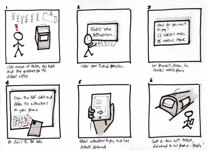
Figure 1: A rough sketch showing how people might interact with the system. Click the image for a larger view.
As you can tell, art was never my strong point at school. But this isn’t about making things look good, it’s about conveying the essence of the idea. Before showing it to customers, it's probably a good idea to improve the visual look of the storyboard. It's easy to do this by tracing over some relevant images and pasting them on top of photos taken in context, like so:
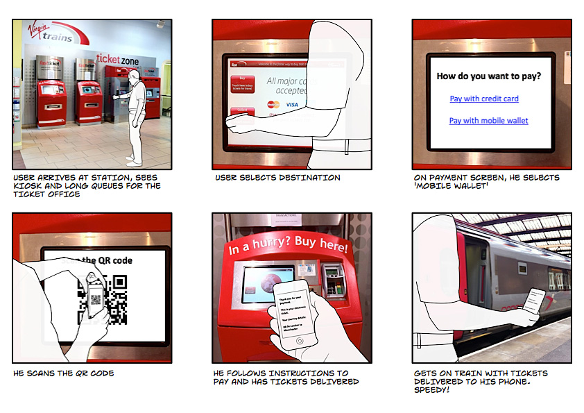
Figure 2: A slightly more sophisticated version of Figure 1. I created the images by tracing over suitably-posed photographs and then I combined the sketches with photographs taken at a train station. Click the image for a larger view.
It’s clear that there are a few risks that we need to explore with customers. We already know that people use kiosks at rail stations, so we can be confident that people will get over the first couple of steps. But here’s some more serious leap-of-faith questions that occur to me about this idea:
Now we have something that we can show to rail travellers: it will take them less than a minute to digest what’s in the storyboard. We can then test two hypotheses:
For example, as a result of testing this solution with customers, we might find that most people see little benefit in paying by phone because it simply adds more steps to the process. So instead, we might ‘pivot’ and come up with a new idea: perhaps we should display a poster near the kiosk with QR codes next to the most popular journeys from the station. People can then scan their journey and complete the whole process on the phone without needing to use the kiosk at all. We then storyboard this new idea, and test again.
A second lean way to evaluate your business idea is to create a paper prototype that shows in detail the steps that you expect the user to take to achieve their goals. Paper prototypes combine hand drawn buttons, labels and user interface elements with sticky notes to help you craft an interactive experience.
The idea is that you sit users down in front of the prototype, give them a scenario (“Buy a ticket from London to Manchester”) and tell them to use their finger as the mouse. As each new selection is made, you update the screen with sticky notes to reflect the choices that have been made.
Paper prototypes are quick to create — if you spend more than a couple of hours, you’re taking too long — and will give you definitive feedback on the usability or otherwise of the workflow you’ve created. At the end of the test, you'll know the percentage of users who could complete the task: the acid measure of usability.
When I’ve written about paper prototyping in the past, people have been quick to comment that paper prototyping is old fashioned and that electronic prototyping tools are much more efficient. Personally, I don’t see this as an either-or: there’s room in the design process for both types of prototyping. However, the time for electronic prototyping isn’t at the initial stage of an idea. As Ries points out, you want to minimise your time through the iteration loop so you can learn most quickly. Paper prototyping is perfect for that initial phase because it’s much quicker than electronic prototyping and easily amenable to modification as you test it out with users. Prototyping, as Jeff Gothelf has pointed out, is the fastest way between you and your customers.
With a Wizard of Oz test, the user interacts with a system which appears to be fully programmed but in fact all of the system’s responses are being controlled by a human operator, just like in the eponymous musical. One of my favourite examples of this — the Mechanical Turk — actually predates the movie by nearly 200 years and serves as a wonderful example of the technique.
The Mechanical Turk was a large, chess-playing machine built around 1770 (see Figure 1). If you played a game of chess against the machine, you would sit down at a proper-sized chess table opposite a mannikin wearing Turkish dress (hence the name). The mannikin would grasp and move chess pieces around the table in response to your moves. It would also probably beat you — the Turk was able to beat most human chess players that it played against, including (apparently) Napoleon and Benjamin Franklin.
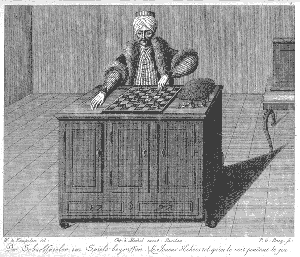
Figure 1: An engraving of the Mechanical Turk. (From Wikipedia).
The machine, however, was a fake. Hidden inside was a human chess player who moved the pieces around using magnets. Although some people suspected it was a hoax, the illusion was so well created that it was many years before the machine’s inner workings were revealed.
For our purposes, what’s critical about the Turk was that people thought they were really playing against a machine. They had no idea that a human operator was hidden inside the box and animating the mannikin.
To show how we can create a similar illusion with our business idea, let me give you a more up-to-date example.
A while back I was working on the design of an interactive voice response system for a cinema booking system. The idea was that people could ask the system questions over the telephone (a bit like Apple’s Siri, although this was a long time before good speech recognition was in place). We pre-recorded a small number of responses that we knew we would have to use (e.g. “Can you say that again?”) but because we didn’t know the specific questions that people would ask, we couldn’t pre-record the answers.
Instead, we used text to speech technology to create the illusion that the system was working, with me playing the Mechanical Turk. The user would ask a question, such as, “What films are showing this afternoon that are suitable for families?” and then I would quickly type in, “We have 4 films suitable for families”. The system would read this to the user over the phone in a text-to-speech, computerised voice. While this was being spoken, I would then type in the names of the films.
It was hectic and required fast typing skills but our users truly believed that were interacting with a live system that could do excellent speech recognition. We were able to use this to test out the business idea and identify the most common questions before the client invested in the extensive (and expensive) technology to support it.
There are three fundamental principles of user centred design. These are:
(For more detail on these principles, download our free Fable of the User Centred Designer). I’m delighted that Ries’ (an entrepreneur-in-residence at the Harvard Business School) has brought these principles to the attention of senior managers since it now makes our job much easier.
With your help, we can make sure that the idea of testing business ideas by developing prototypes — dozens of prototypes, not just a couple of iterations — becomes commonplace.

Dr. David Travis (@userfocus) has been carrying out ethnographic field research and running product usability tests since 1989. He has published three books on user experience including Think Like a UX Researcher. If you like his articles, you might enjoy his free online user experience course.

Gain hands-on practice in all the key areas of UX while you prepare for the BCS Foundation Certificate in User Experience. More details

This article is tagged iterative design, strategy, prototyping, usability testing.
Our most recent videos
Our most recent articles
Let us help you create great customer experiences.
We run regular training courses in usability and UX.
Join our community of UX professionals who get their user experience training from Userfocus. See our curriculum.
copyright © Userfocus 2021.
Dr. David Travis (@userfocus) has been carrying out ethnographic field research and running product usability tests since 1989. He has published three books on user experience including Think Like a UX Researcher.
Get hands-on practice in all the key areas of UX and prepare for the BCS Foundation Certificate.
We can tailor our user research and design courses to address the specific issues facing your development team.
Users don't always know what they want and their opinions can be unreliable — so we help you get behind your users' behaviour.