
UX Certification
Get hands-on practice in all the key areas of UX and prepare for the BCS Foundation Certificate.

“Design is easy,” writes branding expert Marty Neumeier. “All you do is stare at the screen until drops of blood form on your forehead.” One element that makes design difficult is a lack of constraints. Focusing on your product’s red routes provides the key constraint you need to ship a high value product from version 1.

Photo by Adam Grabek on Unsplash.
With most development methodologies, there’s some kind of negotiation around what needs to be developed first. For example, with Scrum, the product owner and the development team negotiate on which items in the product backlog will be the focus of the sprint’s development effort at the beginning of each sprint. The product owner is supposed to be guided by the business objectives when prioritising the list whereas the development team judge how much work they can take on during that time frame.
In practice, product owners rarely have all the information they need to prioritise the list. There may be one atypical customer who’s calling for an atypical function. Or a salesperson who really, really needs a function to close a sale. Or the development team may suggest a set of functions that are quick to implement but may not offer the best customer value. A better way to focus development is to use the idea of red routes to prioritise the product backlog.
Red routes are the key tasks that users want to carry out with the product. Most systems have just a handful of red routes: these are the key activities that people expect to be able to complete with the system: these are the reasons why people have purchased it. But although you can get almost anyone to start using your product, people won’t continue to use it unless the red routes are well served. If the red routes aren’t obstacle-free, you’ll have an uphill task convincing users to continue using the system.
You can decide if one of the product backlog items lies on a red route by asking two simple questions:
This is easier to explain with an example, so let’s turn to one now.
I examined a Tom Tom in-car satellite navigation system to classify the various functions that it supports according to these dimensions. Before looking at the diagram below, stop for a second and think about designing an in-car satellite navigation system. What would you say are the red routes?
When I ask people this question they tend to give me various answers which essentially boil down to one task: planning a route. People tell me, “I want to travel from A to B”.
In the diagram below, I’ve plotted some of the functions from the Tom Tom system according to the two dimensions above. For each function, I first asked: “How often is this function used?” I classified my answer using four categories: “All of the time”; “Most of the time”; “Some of the time”; and “Very little of the time”. I then asked, “How many people use that function?”, and classified this as “Few of the people”, “Some of the people”, “Most of the people” and “All of the people”.
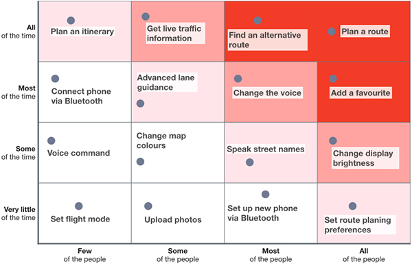
The answer to these two questions determines where the function (analogous to our product backlog items) will plot in the table. For example, “Plan a route” is a function that all of the people want to do all of the time — indeed, why else would you have a sat nav? Similarly, “Add a favourite” is a function that all of the people would want to do most of the time, and “find an alternative route” is a function that most of the people would want to do all of the time. So these functions plot towards the top right of the table, which I’ve colour coded red.
But then there are some other functions, like “Set flight mode”. This function allows you to turn off the system’s GPS. I’ve thought long and hard why you would want to do this, and I must admit to being somewhat puzzled. Who would want to take their sat nav on an aeroplane and turn off the GPS? (It might be quite interesting to leave the GPS connected and observe the flight plan unfold before your eyes, but a sat nav is a fairly useless product without a GPS signal). So I figured that function would be of interest to only a few people, very little of the time and I placed at at the bottom left corner.
As another example, let’s consider the function, “Upload photos”. Did you know you could upload photos to a Tom Tom sat nav system? I’m not sure when you would take the time to view your photographs, however. It’s true that traffic congestion is a way of life but it’s not quite so bad that drivers are searching for in-car distractions. So I figured that this function would be one that some of the people would want to use very little of the time and plotted it down towards the bottom left.
(As a side note, thinking about these two functions made me re-think the use case. Maybe the engineers at Tom Tom had this idea in mind: you’re travelling on an aeroplane and want to view some photographs of your family. You put your small smartphone away in the luggage compartment and instead retrieve your bulky Tom Tom from your carry-on bag. You then proceed to look over the images. Hmm. Still not convinced).
I encourage you to do this exercise too. Your answers may differ slightly from mine: after all, this table is based on a sample size of one. But I’m confident that the functions that I’ve plotted at the top right will be the same functions that you would also place at the top right. That’s why they are red routes.
I’ve colour coded the table to indicate the way you can use this table to prioritise the product backlog. The ones I’ve coloured red should be the highest priority items. A system that supports these tasks — the red routes — is equivalent to what people in the Lean community refer to as an MVP: a minimum viable product.
Once those functions are adequately supported and only if needed you might want to move on to the functions I’ve colour coded in a lighter red colour. And after that, consider implementing the functions I’ve colour coded pink.
I’m sure you get the idea. I encourage you to use this simple visualisation on your next project (whether or not you use Scrum) to help identify your system’s red routes and to show which functions you should implement first.
Find out more on our 3-day, user experience immersion seminar.

Dr. David Travis (@userfocus) has been carrying out ethnographic field research and running product usability tests since 1989. He has published three books on user experience including Think Like a UX Researcher. If you like his articles, you might enjoy his free online user experience course.

Gain hands-on practice in all the key areas of UX while you prepare for the BCS Foundation Certificate in User Experience. More details

This article is tagged strategy, task scenarios, tools.
Our most recent videos
Our most recent articles
Let us help you create great customer experiences.
We run regular training courses in usability and UX.
Join our community of UX professionals who get their user experience training from Userfocus. See our curriculum.
copyright © Userfocus 2021.
Dr. David Travis (@userfocus) has been carrying out ethnographic field research and running product usability tests since 1989. He has published three books on user experience including Think Like a UX Researcher.
Get hands-on practice in all the key areas of UX and prepare for the BCS Foundation Certificate.
We can tailor our user research and design courses to address the specific issues facing your development team.
Users don't always know what they want and their opinions can be unreliable — so we help you get behind your users' behaviour.